Clinical Data Analysis
The Clinical Data Analysis tool allows for a set of customizable charts to be generated for a set of clinical attributes. Users can select which clinical fields they want to display and visualize the data using various supported plot types. The clinical analysis features include:
- Ability to select which clinical fields to display
- Examine the clinical data of each field using these visualizations:
- Histogram
- Survival Plot
- Box and QQ Plots
- Create custom bins for each field and re-visualize the data with those bins
- Select specific cases from a clinical field and use them to create a new cohort, or modify/remove from an existing cohort
- Download the visualizations of each plot type for each variable in SVG or PNG
- Download the data table of each field in JSON or TSV format
- Print all clinical variable cards in the analysis with their active plot to a single PDF
Enabling Clinical Variable Cards
-
In the Analysis Center, select the Clinical Data Analysis tool card.
-
In the Clinical Data Analysis tool, use the control panel on the left side of the analysis to display which clinical variables you want. Select the "Only show properties with data" option to limit the list to only the variables that are populated with values for the current cohort. To enable or disable specific variables for display, click the on/off toggle controls:
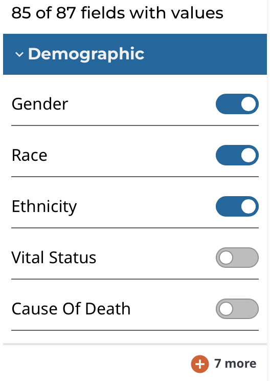
The clinical fields are grouped into these categories:
- Demographic: Data for the characterization of the patient by means of segmenting the population (e.g. characterization by age, sex, race, etc.).
- Diagnosis: Data from the investigation, analysis, and recognition of the presence and nature of the disease, condition, or injury from expressed signs and symptoms; also, the scientific determination of any kind; the concise results of such an investigation.
- Treatment: Records of the administration and intention of therapeutic agents provided to a patient to alter the course of a pathologic process.
- Exposure: Clinically-relevant patient information not immediately resulting from genetic predispositions.
- Other Clinical Attribute: Clinical attributes extraneous to other specified clinical categories that were not directly used to diagnose the primary disease.
Exploring Clinical Card Visualizations
Users can explore different visualizations for each clinical field they have enabled for display. All cards support histograms and survival plots. Additionally, continuous variables can be graphically represented as box and QQ plots. To switch between plot types, click the different plot type icons in the top-right of each card.
Histogram
The histogram plot type supports these features:
- View the distribution of cases (# and % of cases) in the cohort for the clinical field's data categories as a histogram
- View the distribution of cases in tabular format
- Select the cases for specific data categories to create new cohorts, append to existing cohorts, or remove from existing cohorts
- Download the histogram visualization in SVG or PNG format
- Download the raw data used to generate the histogram in JSON format
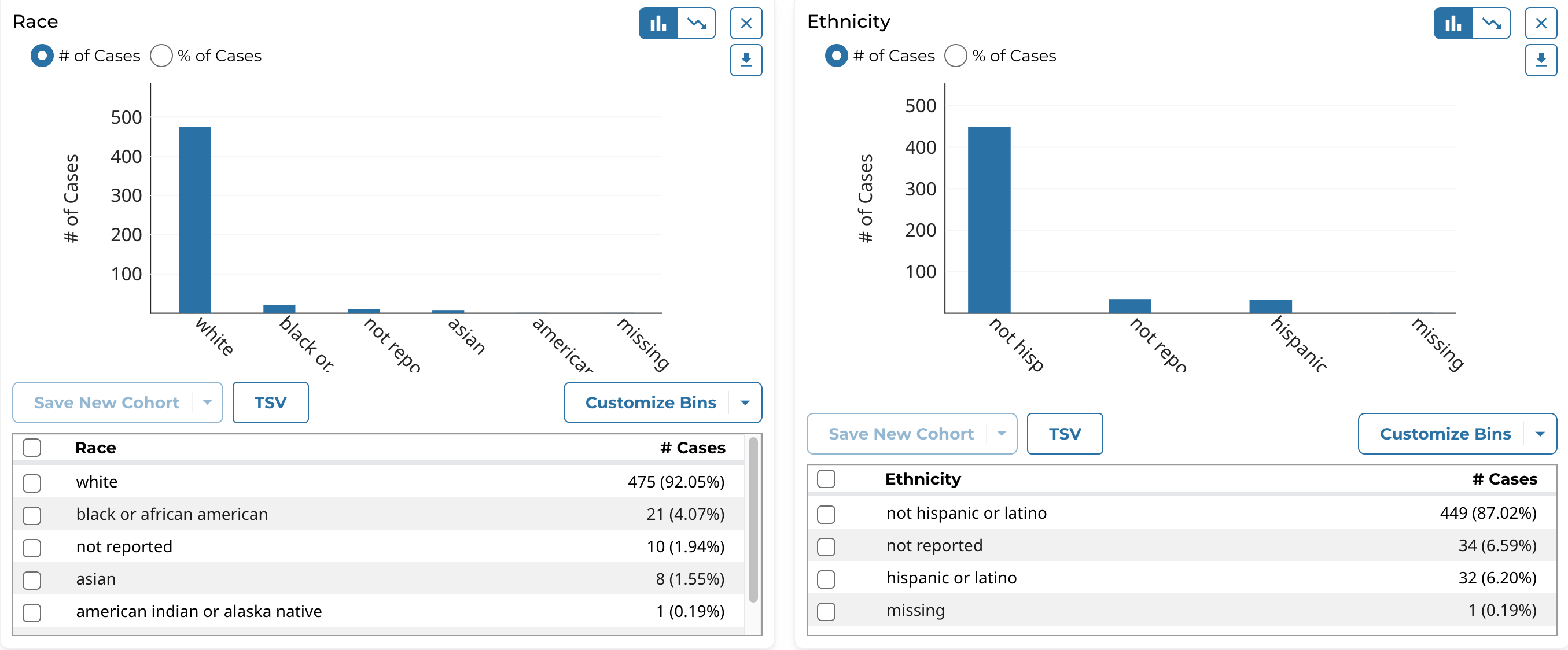
Note that the histogram plot applies to, and can be displayed for, both categorical and continuous variables.
Survival Plot
Survival analysis is used to analyze the occurrence of event data over time. In the GDC, survival analysis is performed on the mortality of the cases. Thus, the values are retrieved from GDC Data Dictionary properties and survival analysis requires the following fields:
- Data on the time to a particular event (days to death or follow up).
- Fields: demographic.days_to_death, diagnoses.days_to_last_follow_up, or follow_ups.days_to_follow_up
- Information on whether the event has occurred (alive/deceased).
- Fields: demographic.vital_status
Survival analysis in the GDC uses a Kaplan-Meier estimator:

Where:
- S(t) is the estimated probability that a subject will survive past time t.
- ni is the number of subjects at risk at the beginning of time period ti.
- di is the number of subjects who die during time period ti.
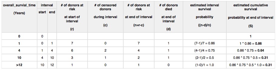
The following table shows an example data set for seven subjects.
| Subject | Time (Years) | Vital Status |
|---|---|---|
| A | 1 | Dead |
| B | 2 | Alive |
| C | 3 | Alive |
| D | 4 | Dead |
| E | 5 | Alive |
| F | 10 | Dead |
| G | 12 | Alive |
The survival estimate for the seven subjects can be calculated as follows.
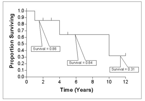
The calculated cumulative survival probability can be plotted against the interval to obtain a survival plot like the one shown below.
The survival plot type supports these features:
- View the distribution of cases (# and % of cases) in the cohort for the clinical field's data categories as a table.
- Select and plot the survival analysis for the cases of specific data categories in the table:
- By default the top 2 categories (highest # of cases) are displayed.
- Users can manually select and plot up to 5 categories at a time.
- Download the survival plot visualization in SVG or PNG format
- Download the raw data used to generate the survival plot in JSON or TSV format
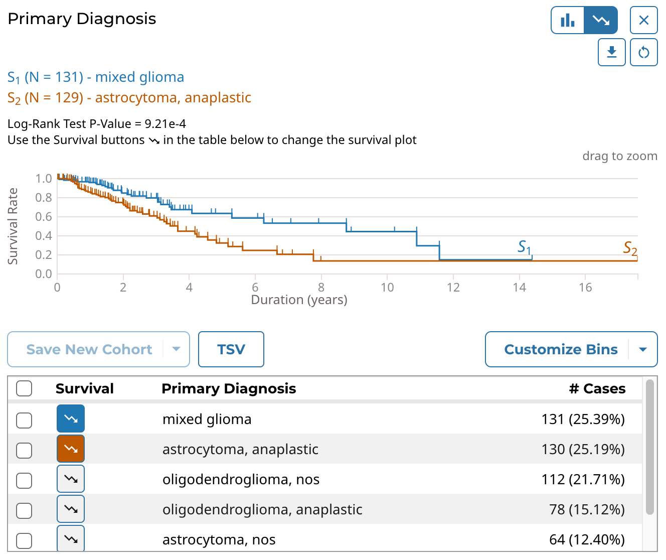
Note that the survival plot applies to, and can be displayed for, both categorical and continuous variables.
Box and QQ Plots
The box and QQ plot types support these features:
- View the quartiles (Q1, Q2/median, and Q3) as well as the mean, minimum, and maximum values in the cohort for the clinical field as a box plot
- View the descriptive statistics in the cohort for the clinical field in tabular format
- Plot the quantiles of the clinical field's distribution with quantiles of a theoretical normal distribution as a QQ plot
- Download the box and QQ plot visualizations in SVG or PNG format
- Download the raw data used to generate the QQ plot in JSON or TSV format
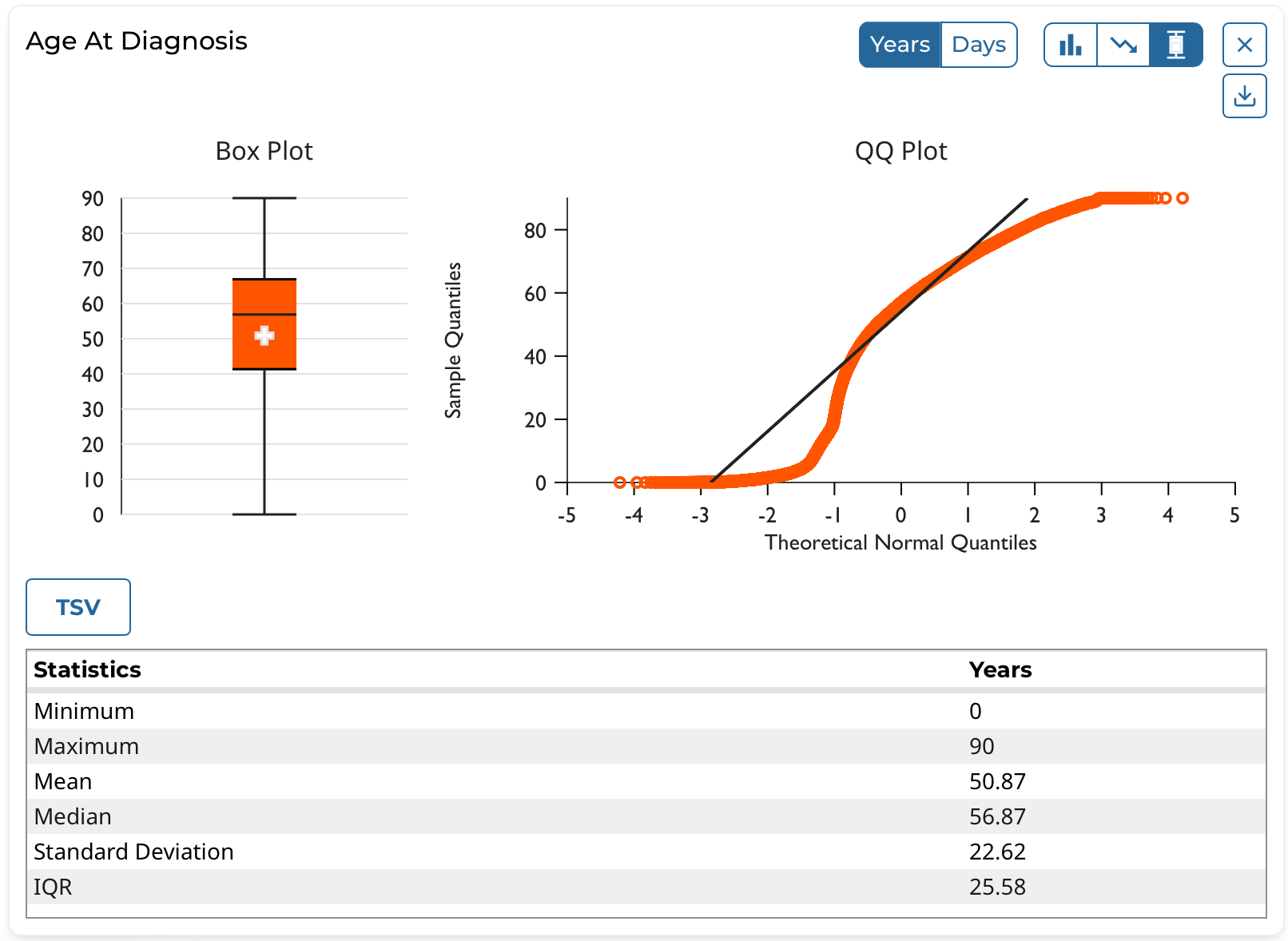
Note that the box and QQ plots apply to, and can be displayed for, continuous variables only.
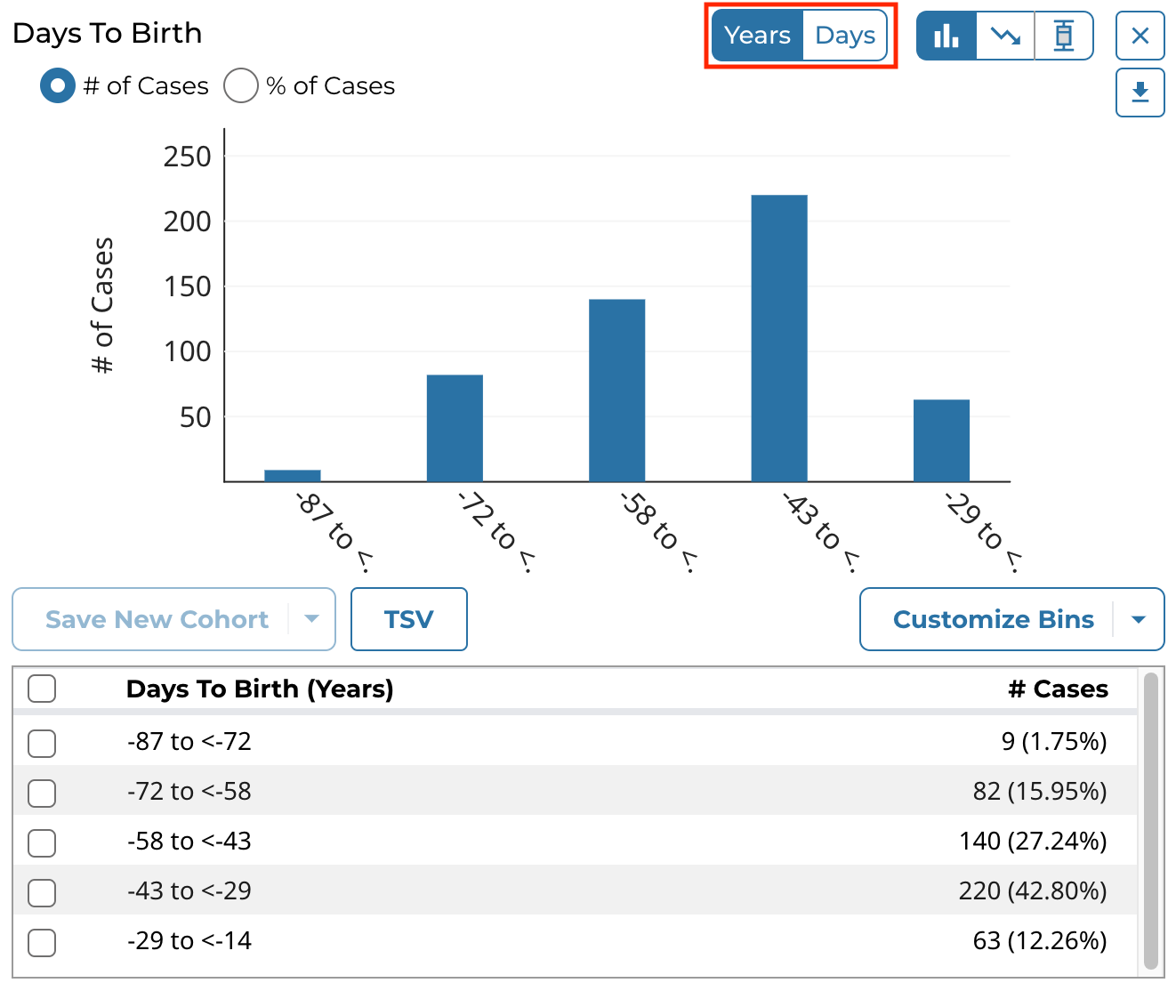
Certain continuous variables that are measured with units of time, such as Days to Birth, include a toggle to switch between displaying the data in years or days. A standard formula is employed for converting between years and days:
- 1 year = 365.25 days
Creating Custom Bins
For each clinical variable, whether categorical or continuous, users can create custom bins to group the data in ways they find scientifically interesting or significant. Once saved, the bins are applied to these visualizations and they are then re-rendered:
- Histogram and associated data table
- Survival plot and associated data table
Custom bins can be reset to their defaults at any time for each card by selecting the Reset to Default option after clicking Customize Bins.
Categorical Binning
To create custom bins for a categorical variable, click Customize Bins, then Edit Bins. A configuration window appears where the user can create their bins:
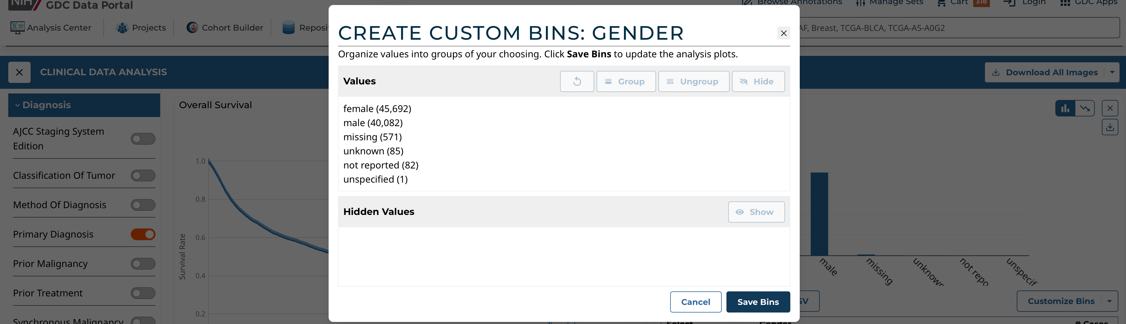
The user can:
- Group existing individual values into a single group
- Give a custom name to each group
- Ungroup previously grouped values
- Completely hide values from being shown in the visualization
- Re-show previously hidden values
Continuous Binning
To create custom bins for a continuous variable, click Customize Bins, then Edit Bins. A configuration window appears where the user can create their bins:
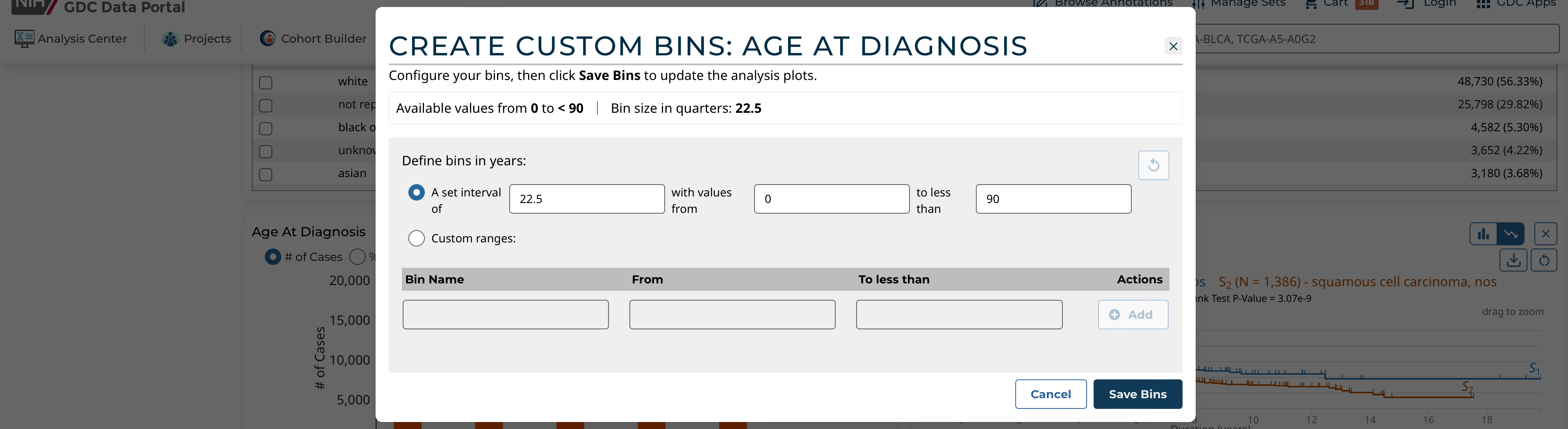
The user can choose one of these continuous binning methods:
- (1) Create equidistant bins based on a set interval:
- User must choose the interval (e.g. equidistant bins of 1,825 days for the Age of Diagnosis field)
- User can optionally define the starting and ending value between which the equidistant bins will be created
- (2) Create completely custom ranges:
- User manually enters 1 or more bins with custom ranges
- User must enter a name for each range and the start and end values
- The ranges can be of different interval lengths