Cohort Comparison
The Cohort Comparison tool displays graphs and tables that demonstrate the similarities and differences between the active cohort and a different cohort. The following features are displayed for each of the two cohorts:
-
A key detailing the number of cases in each cohort and the color that represents each (blue/orange)
-
A Venn diagram, which shows the number of cases shared between the cohorts
-
A selectable survival plot that compares both sets with information about the percentage of represented cases
-
A breakdown of each cohort by selectable clinical facets with a bar graph and table. The facets included are
Ethnicity,Sex at Birth,Race,Vital_Status, andAge_at_Diagnosis. A p-value (if it can be calculated from the data) that demonstrates whether the statuses are proportionally represented is displayed for theEthnicity,Sex at Birth, andVital_Statusfacets. -
Additional cohorts can be created containing subsets of these two cohorts
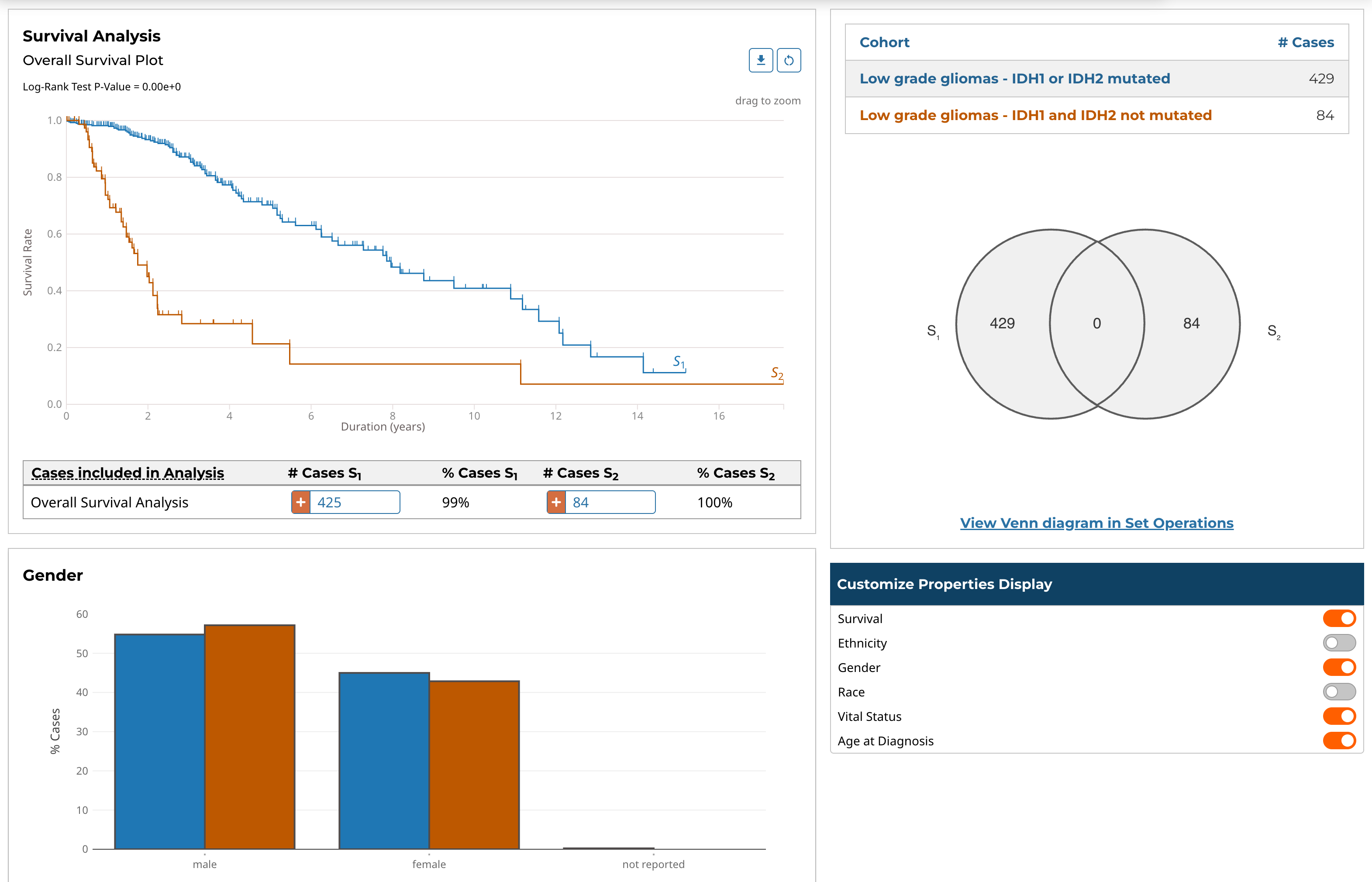
Note that clicking the "Open Venn diagram in Set Operations" link will launch the Set Operations tool with the same cohorts used in the Cohort Comparison tool.